
The retention playbook built from $200M in email and SMS revenue is here.
→ Unlock the Vault
Your email list isn't just full of customers. It's full of people at different stages of trust, awareness, and intent.
Some are ready to buy today. Some need three more emails. Some need six months of value before they're convinced.
Lead nurturing is how you move people through those stages without burning them out or losing them to silence.
The brands with the highest conversion rates from email aren't just sending more campaigns. They're strategically nurturing browsers into buyers by delivering value, building trust, and removing friction at every stage.
Today we're breaking down 8 lead nurturing emails that do this well and what you can apply to your own strategy.
Let’s dive in.
Your Klaviyo email benchmarks are lying to you
"Industry average YoY revenue growth: 18%." Cool. But is that a $500K Shopify brand selling supplements or a $50M selling furniture? Static benchmarks lump everyone together and aren't useful.
Our buddy Larry at CustomersAI built a free Klaviyo audit tool that fixes this. It grades your account across the KPIs that actually matter - revenue growth, deliverability, flow performance, revenue per email, then benchmarks you against brands in your same industry, with similar GMV and AOV.
So instead of "your growth is below average," you get "here's how you compare to 47 other DTC apparel brands doing $2M–$5M a year." A real benchmark worth acting on.
2 Minutes, completely free, and most brands find at least one metric quietly bleeding revenue.
→ Grade your Klaviyo account FREE
*Sponsored
8 Lead nurturing emails that turn browsers into buyers
Not every customer is ready to buy on day one.
Some need time to trust you. Some need more information. Some just need a nudge at the right moment.
That's what lead nurturing emails do. They keep people engaged, build trust over time, and move them closer to a purchase without feeling pushy or salesy.
Here are eight emails that do it right, and what you can steal from them.
1. DIME: Incentivized welcome that builds trust first

What's working:
Founder photo and personal story create immediate connection
Discount code comes after the brand story, not before
Clean, minimal design keeps focus on the message
Multiple CTAs (shop, join community) give options without overwhelming
Clear benefit statement: "clean ingredients and personalized care"
DIME's welcome email leads with the founder's personal story about creating the brand, then offers the discount. This order matters. By introducing the "why" before the "what's on sale," they're building brand affinity first and incentivizing second. The personal touch (founder photo, signature) makes it feel less like a corporate email and more like an introduction from a real person.
How to apply this:
Lead with your brand story or mission before mentioning the discount
Include founder or team photos to humanize the email
Keep the design clean so the story and offer both stand out
Offer multiple ways to engage (shop, follow, join community)
Make the discount code easy to find and use
2. Prose: Educational content that positions the product
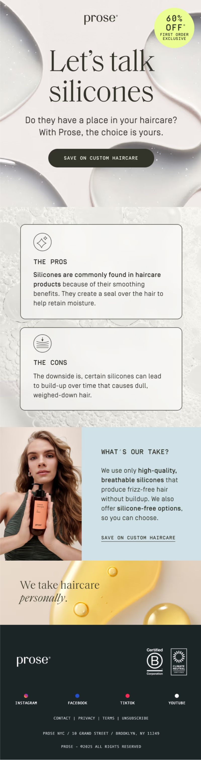
What's working:
Educational headline: "Let's talk silicones"
Pros and cons format builds trust by being balanced
"What's our take?" section positions their solution without being pushy
Clean visual hierarchy with icons and clear sections
CTA feels natural after the education ("Save on custom haircare")
Prose educates subscribers about a haircare ingredient (silicones) by laying out both pros and cons. This builds credibility because they're not just pushing their product, they're helping people make informed decisions. Only after educating do they share their approach (high-quality, breathable silicones with silicone-free options).
How to apply this:
Educate people about a topic related to your product category
Present balanced information (pros and cons) to build trust
Position your product as the informed choice, not the only choice
Use visual structure (icons, sections) to make content scannable
Place CTAs after you've delivered value, not before
3. Laird Superfood: Free resource that drives product discovery
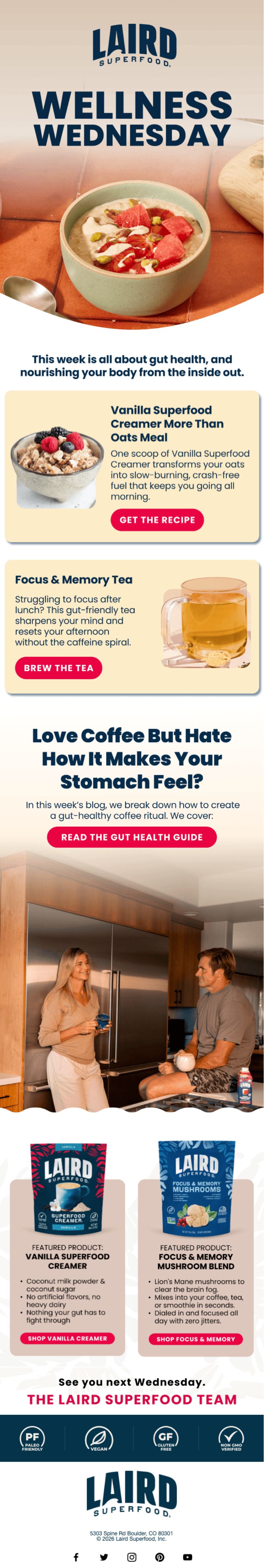
What's working:
"Wellness Wednesday" creates a recurring content series
Each resource (recipe, tea guide, blog) ties to a specific product
Clear CTAs for each piece of content ("Get the Recipe," "Brew the Tea")
Product callouts at the bottom showcase what's featured
Lifestyle imagery reinforces the wellness positioning
Laird Superfood uses educational content (recipes, health guides) to introduce products naturally. The free resources provide value (how to make gut-healthy oatmeal, focus-boosting tea) while creating reasons to try their products. By the time you get to the product showcase at the bottom, it doesn't feel like selling.
How to apply this:
Create free resources that solve problems your products address
Tie each resource to a specific product naturally
Use recurring content series (like "Wellness Wednesday") to build anticipation
Include product callouts at the end so people know what to buy
Make content visually appealing with lifestyle photography
4. Beekeeper's Naturals: Social proof that removes purchase hesitation
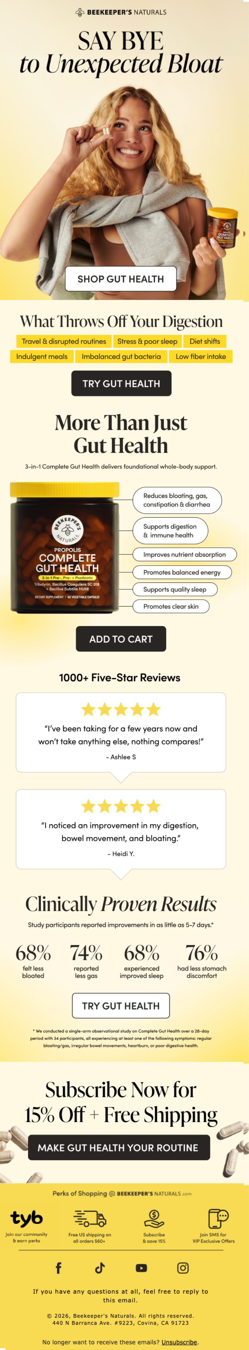
What's working:
Multiple customer reviews with star ratings and names
"Clinically Proven Results" section with specific percentages
Problem-solution framing ("Say Bye to Unexpected Bloat")
Visual callouts for what the product addresses (travel, stress, diet shifts)
Multiple CTAs positioned after different proof points
Beekeeper's Naturals builds the case for their gut health product by stacking different types of proof: customer testimonials, clinical study results, and specific use cases. Each section removes a different objection (Does it work? Is there science behind it? When would I use it?).
How to apply this:
Layer different types of proof (reviews, stats, use cases)
Include specific customer names and details to make testimonials feel real
Use clinical data or statistics when available
Call out specific problems your product solves
Place CTAs after each proof section to capture intent at different stages
5. Manscaped: Upsell offer that simplifies the decision
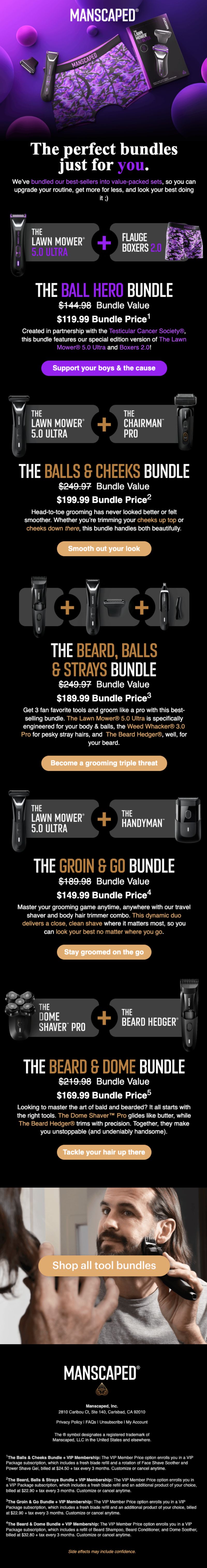
What's working:
Bundle structure makes decision-making easy (pre-curated options)
Visual product presentation shows exactly what's included
Clear value communication (bundle value vs. bundle price)
Each bundle has a specific use case or benefit
Dark, masculine design matches brand identity
Manscaped presents multiple bundle options with clear value propositions. Instead of making customers build their own kit, they've done the work of pairing products that make sense together. Each bundle has a name that communicates the benefit ("The Beard, Balls & Strays Bundle").
How to apply this:
Create bundles around specific use cases or needs
Show bundle value vs. bundle price to highlight savings
Use descriptive bundle names that communicate benefits
Present multiple options at different price points
Include product images so people know exactly what they're getting
6. Native: Product recommendation that reduces choice paralysis
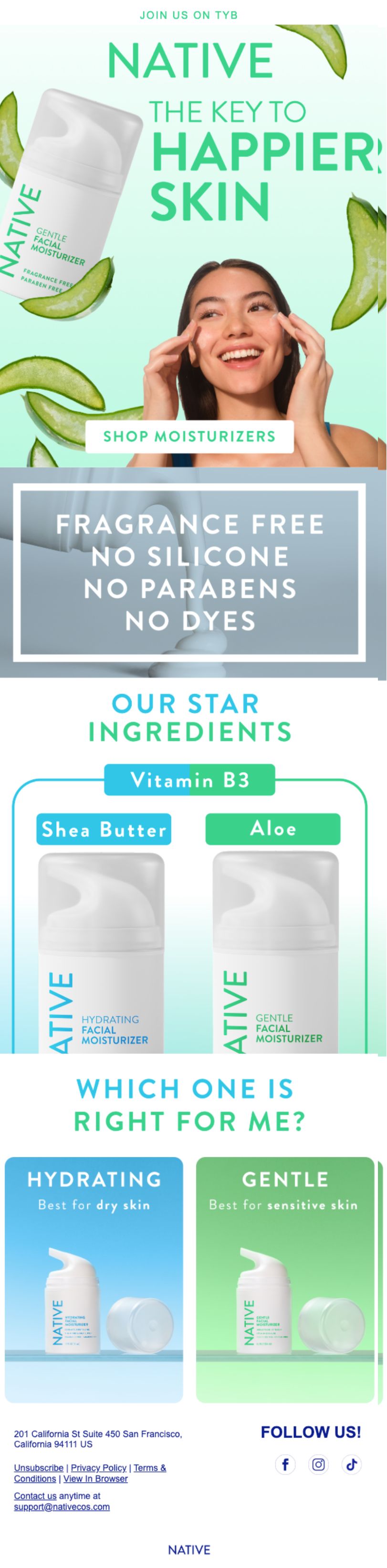
What's working:
"Which One Is Right for Me?" removes decision-making stress
Side-by-side comparison makes differences clear
Star ingredients called out prominently
Clean, colorful design that's easy to scan
Simple choice between two options (not overwhelming)
Native simplifies the decision between two moisturizers by clearly laying out who each one is for (dry skin vs. sensitive skin). The star ingredients are highlighted, the visual comparison is clean, and the choice feels easy instead of overwhelming.
How to apply this:
Help customers choose between products instead of just listing options
Use side-by-side comparisons for similar products
Call out key differentiators (ingredients, benefits, who it's for)
Keep choices limited (2-3 options max) to avoid decision paralysis
Use visual cues (color coding, icons) to make differences obvious
7. Abercrombie & Fitch: Review request that incentivizes feedback
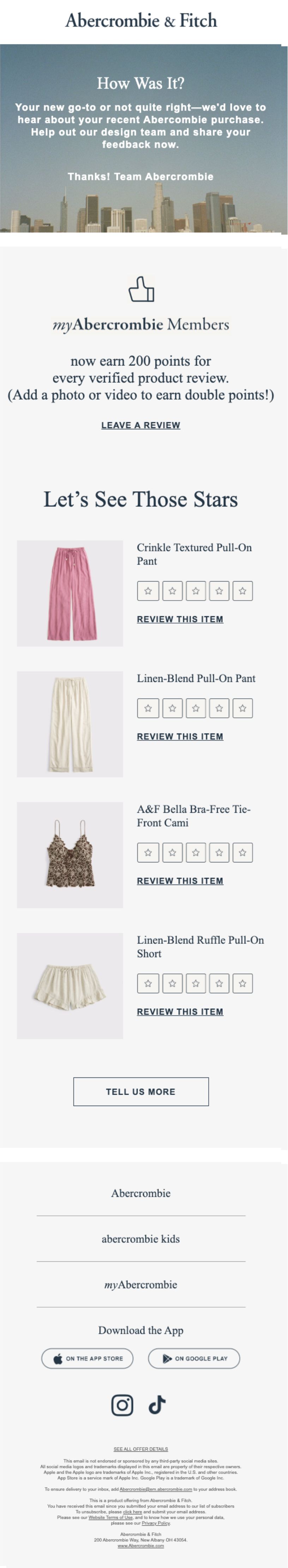
What's working:
Clear incentive: 200 points for verified review
Shows specific products the customer purchased
Simple star rating system makes leaving a review easy
myAbercrombie Members framing makes it feel exclusive
Minimal design keeps focus on the ask
Abercrombie incentivizes reviews by offering loyalty points, then makes the process as easy as possible. They show you exactly which products to review, provide a simple star rating system, and reward you for adding photos or videos (double points).
How to apply this:
Offer a clear incentive for leaving reviews (points, discount, entry)
Show customers exactly which products they can review
Make the review process as simple as possible (star ratings, one-click)
Reward detailed reviews (photos, videos) more than basic ones
Time review requests for when customers have had time to use the product
8. Huha: Loyalty program announcement that celebrates success

What's working:
Celebrates milestones: "13K tried Huha for the first time"
Real customer quotes with names reinforce social proof
"Fruits = Rewards" concept is simple and visual
Clear reward tiers (100 fruits = $5 off, 200 = $10 off, 400 = $20 off)
Playful design matches brand personality
Huha wraps their loyalty program announcement in a celebration of their spring sale success. By sharing specific numbers (13K first-time customers, 21K stocked up) and customer quotes, they create FOMO and community feeling before introducing the rewards program.
How to apply this:
Frame loyalty programs as rewards for being part of a community
Share success metrics to create social proof
Use simple, visual metaphors for points or rewards ("fruits")
Show clear reward tiers so people know what they're working toward
Include social proof (customer quotes) to reinforce the decision to join
What makes lead nurturing emails actually work
Lead nurturing isn't about sending more emails. It's about sending the right emails at the right time with the right message.
The emails that move people from browser to buyer do a few things consistently:
They deliver value before asking for anything. Educational content, free resources, and helpful information build trust. Once you've given value, asking for a purchase feels earned, not pushy.
They reduce friction and hesitation. Product comparisons, customer reviews, and clear benefit statements remove the barriers that keep people from buying. Every objection addressed is one step closer to conversion.
They make decisions easier, not harder. Bundles, curated recommendations, and simple choices help people buy without getting overwhelmed. Decision fatigue kills conversions.
They build trust through proof. Customer testimonials, clinical studies, founder stories, and real results create credibility. People need proof before they trust you with their money.
They create ongoing engagement. Recurring content series, loyalty programs, and community invitations keep people connected to your brand over time. The longer they stay engaged, the more likely they are to buy.
Building lead nurturing sequences that deliver value, build trust, and drive conversions
Here's what to focus on for your lead nurturing emails:
Start with value (education, resources, story) before pushing for the sale
Use social proof strategically (reviews, testimonials, stats) to remove doubt
Simplify decisions with bundles, comparisons, and clear recommendations
Layer different types of content (educational, social proof, incentives) throughout the journey
Make engagement easy with simple CTAs, clean design, and clear next steps
Time your emails based on customer behavior, not just a calendar
Test different approaches and measure what actually drives conversion
Lead nurturing is about playing the long game. Not everyone converts in the first email, and that's fine. The goal is to stay relevant, helpful, and top of mind so that when they're ready to buy, you're the obvious choice.
Do it right, and your nurture sequence becomes one of your highest-converting revenue channels.
Every template, framework, and email used to drive $200M in email revenue
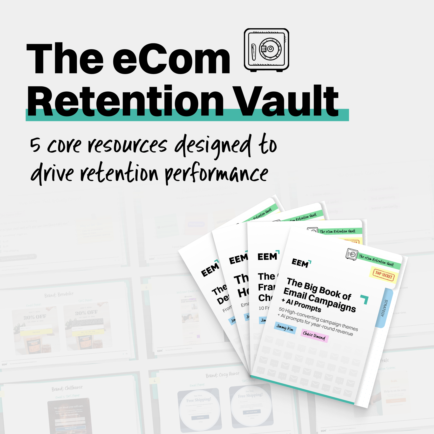
Not a summary. Not a recap. The actual campaigns, flows, and frameworks that moved the needle across thousands of eCom brands over 15+ years.
We've have had a front row seat to retention at scale for a long time. And after watching the same patterns drive the same results over and over, we decided to stop keeping it to themselves.
The eCom Retention Vault is everything we know packaged into one place.
50 proven campaigns with real brand examples and AI prompts so you can deploy your own version fast. Real signup forms, welcome emails, and SMS examples from 20+ top performing brands. 10 copywriting frameworks the best teams use to ship at scale. Design secrets pulled from 10,000+ high performing campaigns.
And lifetime access to a private community of 350+ retention marketers.
This is the resource that took 15 years to build and about five minutes to start using.
Quick Clips:
Retail tech grows up: NRF Nexus 2026 is spotlighting a shift from AI pilots to AI operating systems, with retailers scaling automation across pricing, inventory, fraud, and service. The hard part isn't the tech anymore, it's connecting new tools to legacy systems without breaking the business. If your brand is still stuck in pilot purgatory, you're already behind.
David Protein's $300M flex: Peter Rahal's David Protein is projecting north of $300M in 2026 revenue and just expanded EPG alt-fat capacity five-fold to start supplying CPG partners. They're hitting Walmart, Target, and Costco Texas this quarter, with ice cream on deck. The protein-to-calorie ratio pitch is doing a lot of heavy lifting, and clearly working.
Bylt suits up for omnichannel: The DTC apparel brand is opening 7 new stores this year and launching wholesale with Bloomingdale's, plus expanding distribution in Canada and Australia. Bylt started online in 2016 and already runs 15 retail locations, so this is a DTC-native brand graduating to full omnichannel. The playbook's becoming familiar: build direct, then go everywhere.
Kendra Scott hires for global growth: The brand just named Adrienne Gernand its first chief business officer, tapping a Gap Inc. veteran to lead category and international expansion. CEO Chris Blakeslee is clearly building toward "attainable luxury house" status with fragrance, eyewear, footwear, and Yellow Rose all in the mix. Big ambitions, and the leadership bench to back it up.
Gen Z and Millennials bet on AI shoppers: 62% of Gen Z and Millennials prefer AI-powered shopping tools to reduce the risk of a bad purchase, and 60% of Millennials trust AI over store associates for unbiased advice. But 75% of all Americans say they'd lose trust if AI results were sponsored. The window to build transparent AI shopping experiences is open now, before paid ads close it.
The eCom Email Marketer Newsletter
Subscribe for your weekly dose of retention strategy, actionable insights, & exclusive industry news!
The eCom Email Marketer Newsletter
Subscribe for your weekly dose of retention strategy, actionable insights, & exclusive industry news!